Blogger Template for Business

My Personal Website Project

Dindin Design - Masteringan Blogger Theme

Minggu, 10 Januari 2021

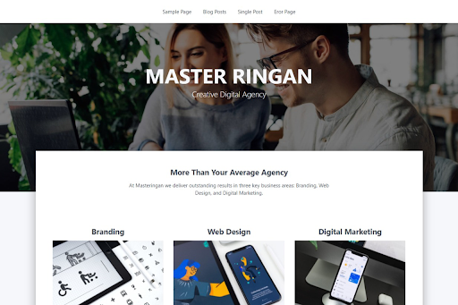
Masteringan is a modern and fast theme, suited for businesses and non-profit organizations. It is highly flexible, with a clean and professional design. Masteringa is the perfect theme to build a great website for your company.

Front Page Widget

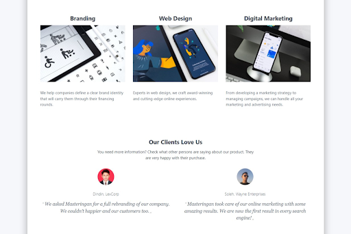
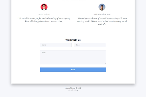
Masteringan comes with front page widget. You can display a list of your Products or Services, Testimonials, or Contact Form. This helps to introduce your business or organization to the site’s visitors.

Responsive Layout

Masteringan is responsive, adapting smoothly to different screen sizes. Your content will always look beautiful on smartphones, tablets, laptops, and desktop screens.

Custom Colours

You can freely change the colours on your Masteringan theme, and make your website look just the way you want it to.

Custom Headers

Masteringan gives you the ability to upload your own header images. You can also customize your blog with a background color or image.

Custom Menu

Through the power of Blogger custom menu system Masteringan gives you full control over the site menu.

Widget Area

Masteringan comes with widget area in the sidebar. This gives you full control of your website content, alloing you to structure things however you wish. For example you can display a list of your Featured Posts, Popular Post, or Text Widget.

Name
Master Ringan


Category
Landing and Corporate

Version
1.0.0

Comments

Postingan Populer

Image

Halo teman-teman! Aku mau cerita tentang salah satu project seru yang aku kerjakan: halaman marketing untuk SEO Panel . Aku nggak bikin seluruh platform-nya, tapi fokus di bagian depan website supaya setiap elemen dan kontennya bisa langsung menyampaikan nilai produk dengan jelas dan mudah dipahami. Awal Proyek SEO Panel punya platform SEO all-in-one yang keren banget di belakang layar, dengan fitur-fitur lengkap buat bantu pengguna meningkatkan peringkat website. Tapi mereka butuh halaman depan yang nggak kalah kuat: tampilannya harus menarik, langsung menjelaskan manfaat, dan bikin pengunjung mau mencoba layanan. Aku mulai dengan memahami audiens mereka: siapa penggunanya, masalah apa yang sering ditemui di SEO, dan apa yang bikin mereka tertarik. Dari situ aku bikin alur konten dan layout yang gampang ditangkap pengunjung dalam beberapa detik pertama. Proses Desain Untuk halaman ini aku pakai WordPress dan Elementor supaya desainnya fleksibel dan nggak perlu coding dari awal. Fokus...

Image

Superingan is a Blogger template designed with simplicity and functionality in mind, offering a clean and user-friendly platform for professional websites. This theme is perfect for various website types, including personal blogs, online magazines, news websites, and portfolios. Features: Responsive Design: Your website will look its best across all devices, from desktops and laptops to tablets and smartphones. Customizable Colors: Easily change the template's colors to match your branding or preferences. Custom Headers: Upload your own header image to add a personal touch to your website. Custom Menus: Create and manage your website's navigation menus with ease. Widget Areas: Add widgets to display additional content and features on your website's sidebar. Clean HTML & CSS Code: The template is built with clean and well-structured code, making it easy to learn and customize further. Superingan is an ideal choice for those seeking a professional website with a sim...

Hi everyone! Welcome back to our CSS Grid series on Dindin Design! In the previous article, we explored how to size our grid columns and rows using fr , px , minmax() , and more. Now that we know how to set up a grid, it’s time to take it to the next level — by learning how to place elements inside the grid. In this article, we’ll learn Grid Item Placement — how to position and span items across your grid using properties like grid-column , grid-row , and grid-area . You’ll also learn how Flexbox and Grid can work together, and how to create overlapping layouts. What You’ll Learn Key Grid terminology: tracks, lines, cells, and items How to place grid items using grid-column , grid-row , and grid-area How to span items across multiple tracks Centering content inside grid items using Flexbox How to create overlapping layouts Grid Basics Refresher Before diving into placement, let’s refresh a few terms: Term Description Grid Container The parent element wi...